Selling the Bearcat
Marketing a mascot is far from easy. The mascot should be strong and fierce to inspire respect from others who see it. But make it too fierce and one runs the risk of scaring people away. The mascot has to be approachable and lovable. But if it is too cute and cuddly, it will fail to inspire respect.
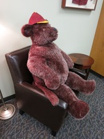
When the bearcat was closely associated with a bear, this was a hard game to play. Depending on how it was depicted, a bear could look like a beast to watch out for while in the woods, or it could look like the teddy bear one had as a child.
Willamette is no stranger to these difficulties, with changing mascot costumes and logos. Even the transition from Barney to Blitz reflected the need for a new way to sell the Willamette Bearcats.
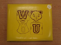
In 1952, Nancy Stuart, then the publicity director, gave the bearcat a "feminine touch." No longer the ferocious beast originally imagined, the bearcat was now a scowling bear in a Willamette sweater. This became one of the most persistent drawn versions of Barney, and was almost certainly the inspiration for Barney's final costume. However, he bears little resemblance to the other versions of Barney.
Although he did not suffer from the same criticism as Barney faced in the 80's and 90's, it is clear that this was not a particularly fierce mascot. In various Collegian articles regarding the history of the bearcat, this version of Barney was described as a "mild looking creature" and perhaps a little plump.
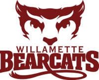
In 2002, the previous athletic logo of a bear paw with claws was replaced with this logo, designed by then Willamette Creative Director Chris Noud. The logo features the face of a bearcat, with a tail extending from the letter R. At the time, athlete Sarah Reichner '03, said in the Collegian, "I've heard people say it looks satanic or mean but I don't get that feeling from it." In fact, it would seem to resemble Blitz, if perhaps a little bit wolf-like.
A major change brought with this logo was that it unified the sports teams, as previously, each team had its own logo. This logo is still in use by all the teams as of 2016.
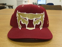
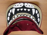
The baseball cap shown here takes advantage of the fact that only the upper half of the face is shown. The face extends on to the top of the bill, only for the underside to reveal a hidden set of teeth.
